Creating a brand color palette is an essential part of establishing a strong visual identity for your business.
A well-chosen palette not only makes your marketing materials more attractive and memorable, but it also conveys a sense of cohesion and professionalism across every platform on which your brand appears.
One of the best places to start when developing a color palette is by looking at your logo, as it's likely the most recognizable asset of your brand.
In this in-depth guide, we'll explore how you can build a comprehensive color palette based on your logo image using ImageColorFinder.com's user-friendly tools.
Follow the steps and tips outlined below to level-up your branding game and ensure your visual identity is consistent and engaging across all channels.
1. Upload Your Logo Image to ImageColorFinder.com
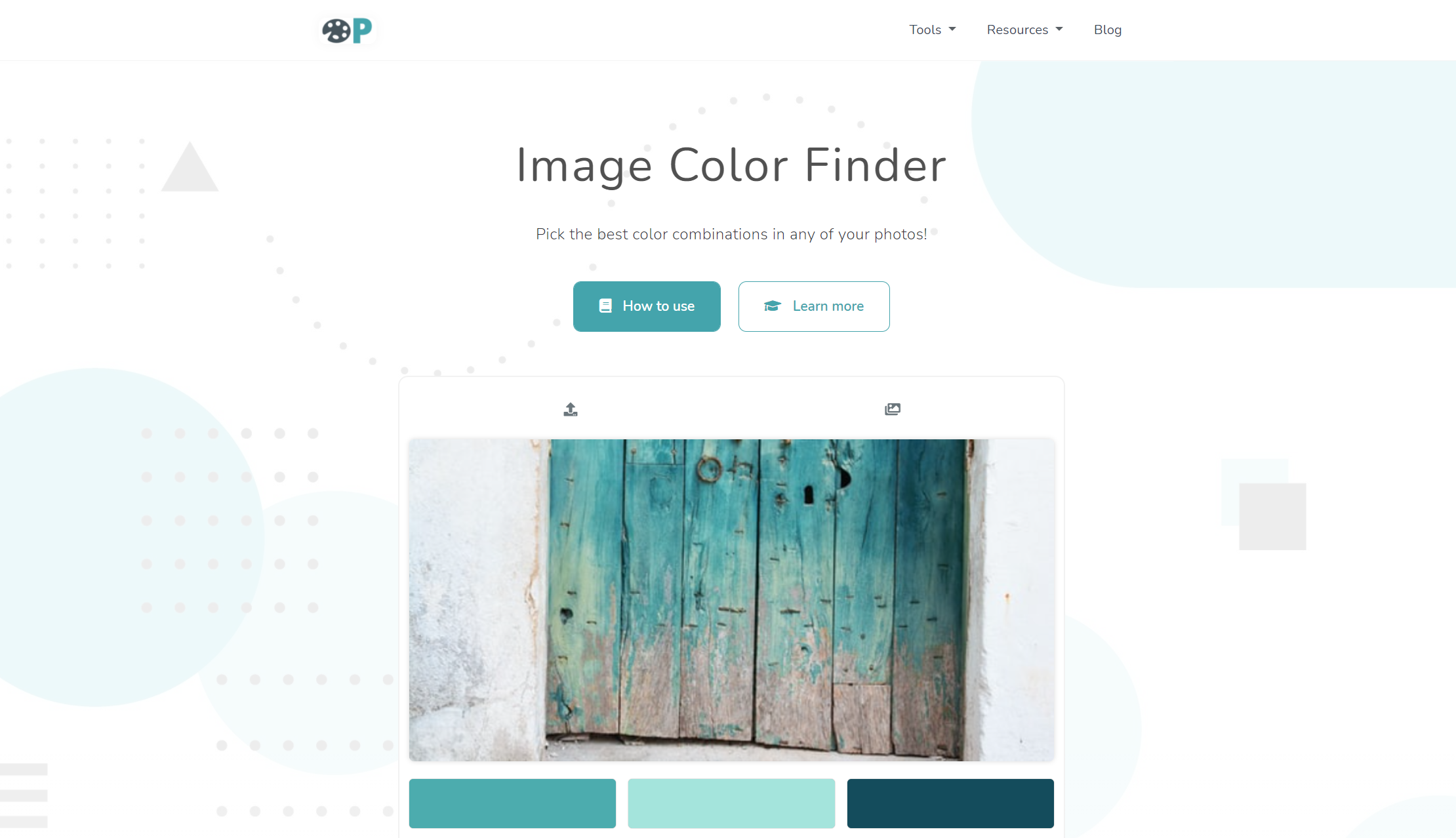
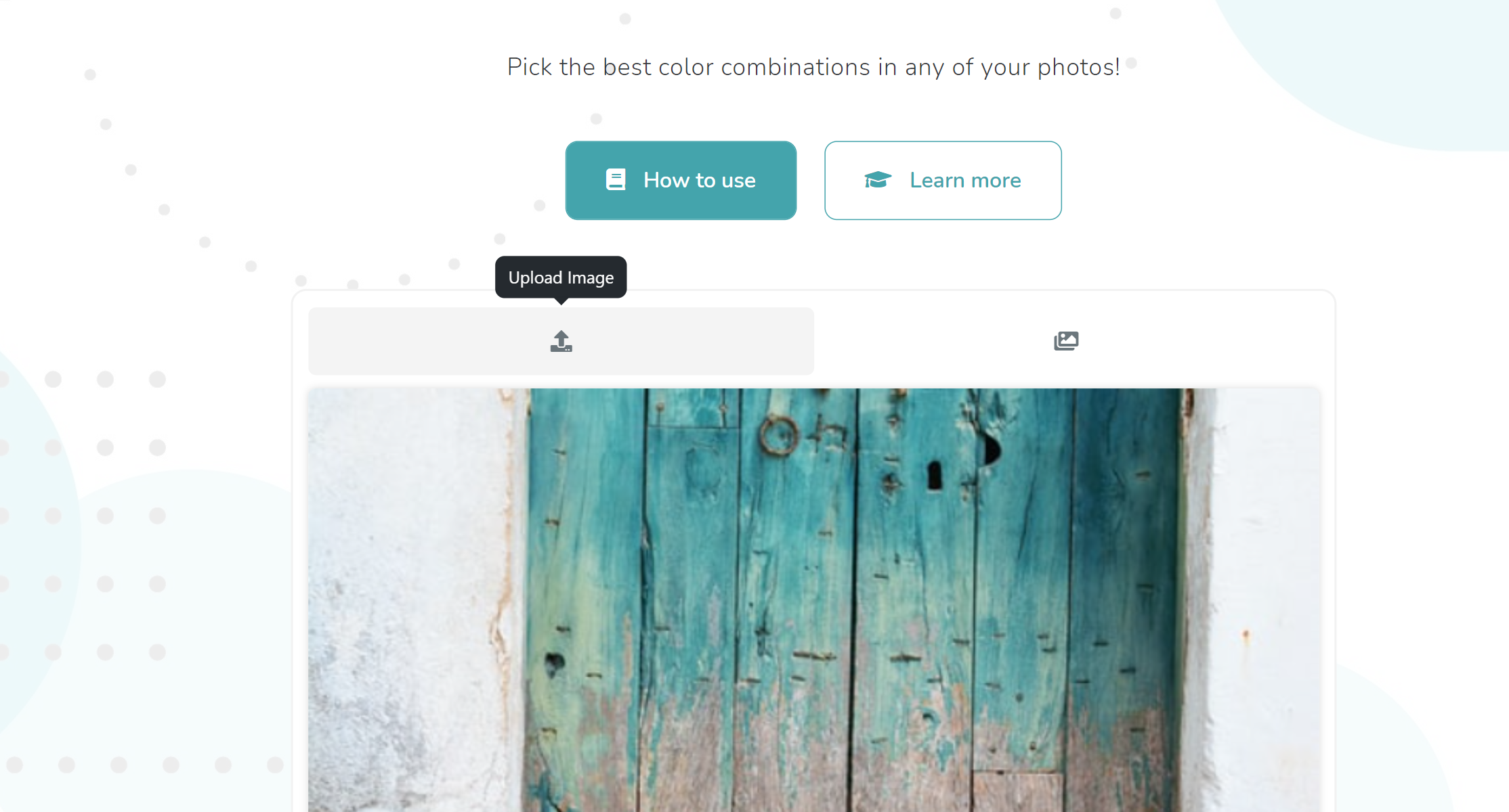
To begin, navigate to ImageColorFinder.com and prepare to upload your logo image.

Click the "Choose File" button and select your logo image from your device.
ImageColorFinder.com supports various image formats such as JPEG, PNG, and SVG.

2. Identify the Colors in Your Logo
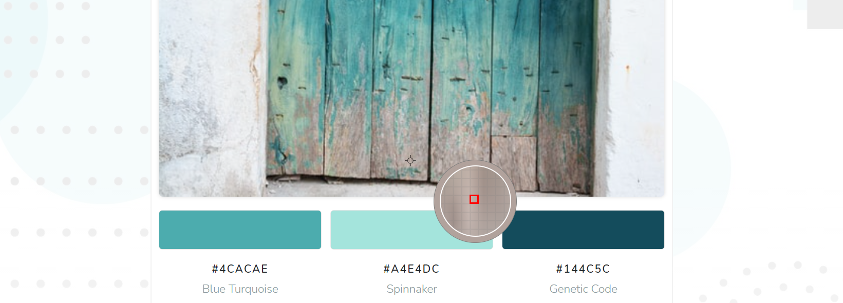
Once you've uploaded your logo image, ImageColorFinder.com will automatically generate a list of the primary colors found within your logo.
Note that the number of colors identified may vary depending on the complexity of your logo and the tool's settings.
Take a moment to review the colors generated, and feel free to click the "eyedropper" icon next to each color for a closer look.

3. Copy the Color Codes and Save Them for Later
With the colors identified, click the "Copy" button next to each color code to save it to your clipboard for later use.
These color codes, in HEX format, will be vital when creating your color palette and applying it to your marketing materials and online presence.

4. Consider Adding Complementary and Accent Colors
While the primary colors found in your logo play a crucial role in your brand identity, incorporating complementary and accent colors can add depth to your color palette.
Complementary colors are those that sit opposite one another on the color wheel, while accent colors are typically lighter or darker versions of your primary colors or contrasting shades that add flair to your palette.
5. Evaluate and Refine Your Palette
Once you've assembled a range of colors that includes primary, complementary, and accent shades, spend some time evaluating the overall harmony and balance of your palette.
Consider how your palette may appear in various contexts, such as marketing materials, social media banners, and your website's user interface.
Don't hesitate to tweak the shades, add or remove colors, and test them in action until you've landed on a color palette that feels cohesive, balanced, and visually captivating.
6. Apply Your Brand Color Palette Consistently Across All Channels
With your color palette finalized, the most important step is to apply it consistently throughout all aspects of your brand's visual identity.
Ensure that your website, social media profiles, advertisements, and even internal communications all adhere to your set color palette to maintain a cohesive and professional appearance.
Consistency in your brand's color usage not only enhances recognition but also builds trust with your audience, ultimately leading to a stronger and more memorable brand.
In Conclusion
Creating a brand color palette based on your logo image is a smart and efficient way to develop a strong visual identity for your business.
ImageColorFinder.com makes it easy to identify the key colors within your logo and save the color codes for further use, streamlining the entire process.
By adding complementary and accent colors, evaluating your palette's harmony, and applying it consistently throughout your brand presence, you'll be well on your way to crafting a captivating visual identity that stands out from the competition.