Creating a cohesive design using colors from images is essential to maintain your brand's tone and consistency across various digital platforms and content.
The task of identifying the perfect color palette and matching colors from an image can sometimes be daunting, as it requires a good understanding of colors and their combinations.
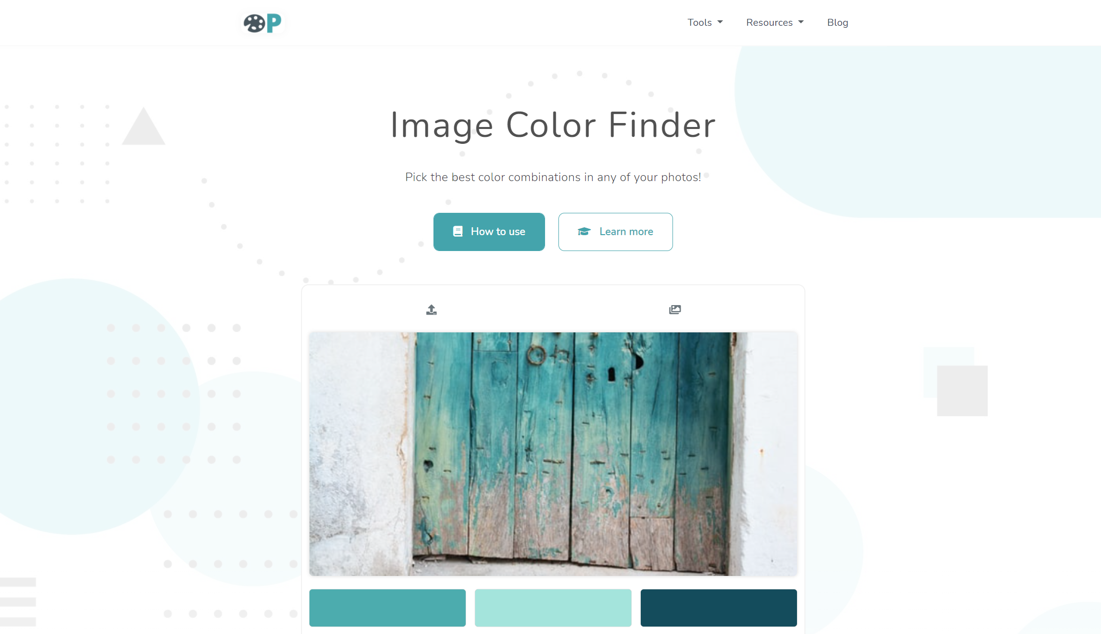
Fortunately, there are some useful tools, such as ImageColorFinder.com, that help you extract and match colors from images, making the process smooth and efficient.
Here, we'll delve into how to find and use colors from images and how to create a pleasing and harmonious color scheme for your design.
Let's get started!
Step 1: Find a Source Image
Select an image you'd like to base your design on; this could be a photograph, illustration, or any other high-quality graphic.
Ideally, the image should reflect the desired aesthetics and tone of your design project.
If you're not sure where to start, think about your project's purpose or theme, and look for visually appealing images that communicate those ideas effectively.
Consider screenshotting or downloading images, and save them in a folder to refer back to throughout your design process.
Step 2: Upload the Image to ImageColorFinder.com
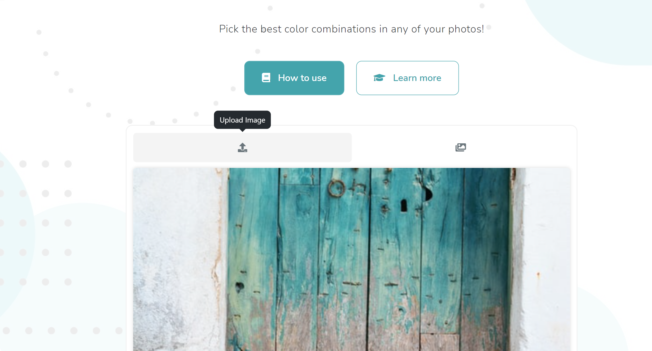
Now that you have a source image, head to ImageColorFinder.com and upload the image to extract color information.
Click on the "choose file" button and browse your computer to locate the image.
Step 3: Extract Colors and Codes from Your Image
Once you upload your image, ImageColorFinder.com will automatically generate a color palette extracted from your image.
You can adjust the number of colors in the palette to better suit your design by using the "number of colors" slider, found below the generated color palette.
If you want to select a specific color from the image, use the custom-built eyedropper tool to choose the color and generate its code.
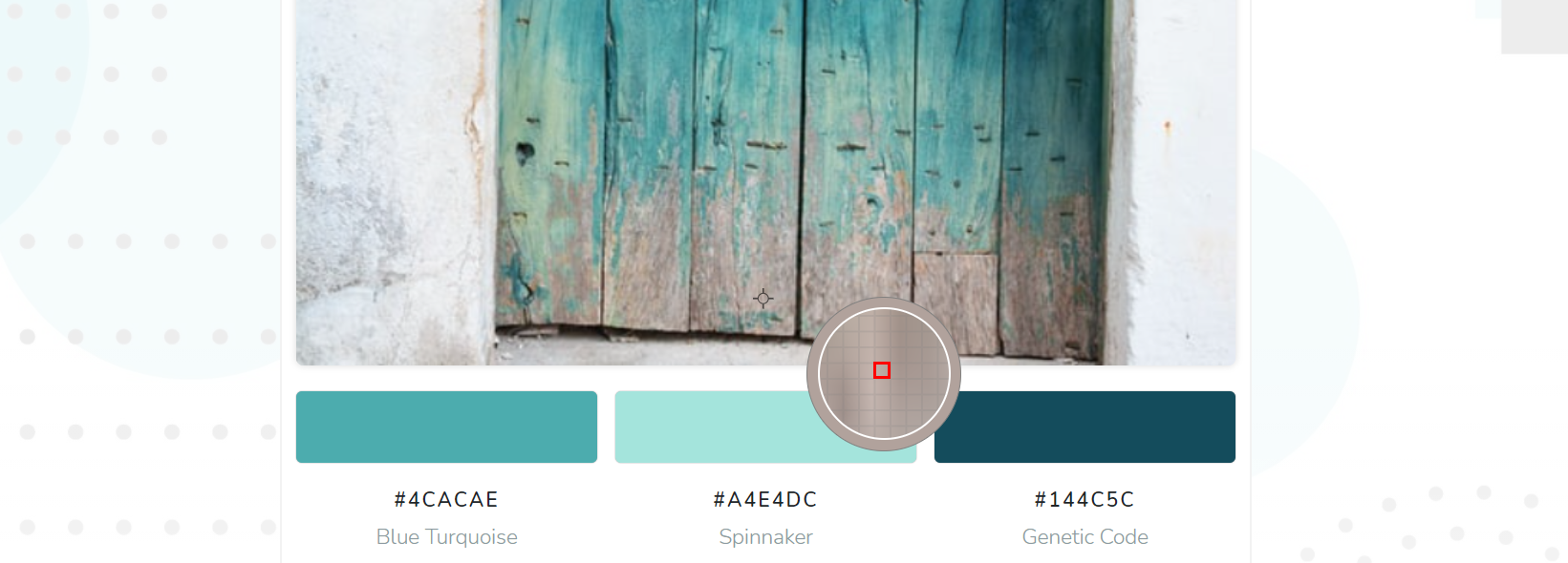
To copy the color codes, simply click on the "copy" button next to each color and apply these codes to your design software or project.

Step 4: Create a Cohesive Design Using Extracted Colors
With your newly copied color codes, you can now create a stunning design using the exact hues found in your source image to achieve a harmonious and visually appealing result.
You might also consider incorporating complementary or contrasting colors to add visual interest and balance without straying too far from your image's dominant color scheme.
Remember that your design should remain versatile and adaptable, so using a sensible mix of colors is essential in maintaining a cohesive project, regardless of future modifications.
Step 5: Test and Iterate Your Design
Lastly, always make sure to test your design and gather feedback from others to ensure your colors and overall layout work well together and effectively communicate your intended message.
Don't be afraid to iterate on your design and make adjustments as needed, continuing to reference your original image to maintain a consistent color story throughout your design process.
In conclusion, creating captivating and consistent designs using colors from images can be a breeze with the help of tools like ImageColorFinder.com.
By following these steps and paying close attention to color relationships in your chosen image, you can derive a harmonious color palette that adds depth, interest, and a strong visual connection to your design project.